Love it or hate it, the iMovie HD interface was always the same. The preview window was always large, often larger than necessary. The clips pane was always three clips wide, which meant for a lot of scrolling if you had too many clips. If you had a large project in your timeline, the only way to see it all was to shrink it to the point it was useless to try to make accurate edits to it.
The funny thing is, I thought I loved it. I always knew where I was and what I was doing. The reality is, I just didn't know things could be different, or, for that matter, better. When I first got into the iMovie '08 interface I felt like someone moved all the rooms around in my house. Just like how I can stumble into the bathroom in the middle of the night, I could move around in iMovie HD without putting much thought into it. In iMovie '08, I was stumbling into walls.
Then I started playing around, and that's when it hit me: I can put stuff just about wherever I want it. It's like moving the door to the bathroom right next to my bed (or even better, next to my three-year-old's bed) then putting it back when I am done. Talk about power. Here is how you customize your interface.
There are going to be a lot of full-size window captures for this one, so when you see an iMovie window, click on it to get the full view.
The default
This window is what most of you are now seeing in iMovie '09:
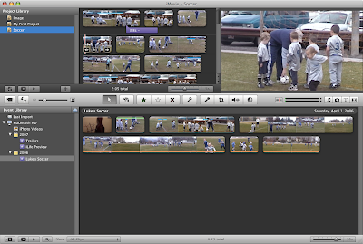
This really isn't a bad way to start. What you should notice if you are coming from iMovie HD is that your preview window is really small, much smaller than you are accustomed to. But think about it, did you really need to see your footage that closely? Probably not, especially because there was always the full screen preview. (It was like ordering food in America. "Did you want that extra large or super extra large?") When scrubbing through your rough footage, smaller is better because...
Now you can see more of your footage at once. Notice how the Event Browser takes up a full two thirds of the window. All the more room to see where you have been and where you am going. This isn't a big deal if you have twenty minutes of footage, but what if you have 300 minutes? It makes a lot more sense to have your rough footage get the lion's share of window real estate, for now at least. Sure the project window is small as a result, but it's big enough for me to drop footage into. At the start of making my movie, that is all I need it to do.
Trading Places
So what happens when my project is getting too big for comfort? Editing a large movie in something the size of a playing card only invites frustration. There are two ways to deal with this.
If I am the kind of person that always wanted timelines to run vertically--so I can feel like I am skydiving--I can just drag on any part of the middle toolbar not occupied by a button or slider and drag that bar downward. (I could also drag it upward if I wanted more room for my source footage.) Dragging the toolbar gives me this:
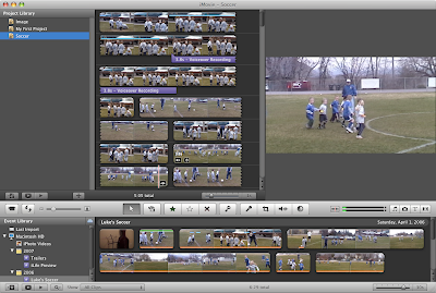
Probably not the improvement you were hoping for. Method number two of granting more real estate to your project will get the job done much better. On the middle toolbar, you will see a button with facing, curved arrows. Go ahead and give it a click.

Voila. Now all that space that was dedicated to your Event Browser appears to be not so dedicated. This is the kind of room you can really use to dig into your project with transitions, additional edits, and audio tracks.
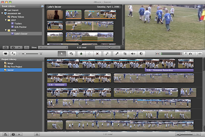
This space becomes even more useful if you use the "Trim..." feature to re-edit clips within your project. All of this and a cool animation to boot. (Can't get enough of watching your project flushed to the bottom of the window? Hold down the Shift key while you click the button. Slo-mo!)
Now you see it...
There is even more room to capture, for either my project or my source footage. What's up with those lists, either my project list or my events list? If everything I want is in a single event, and the only place it's going is into a single project, then why keep those lists in view? Click the little star-page button below either your events list or your project list.

Ahhhhhhh. Now we can really stretch out.
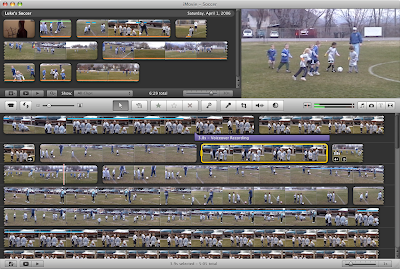
Of course, the same buttons will bring your lists back.
When things are big that should be small*
So what if something is big and you want it smaller? What if something is small, and you want it bigger? Let's make it happen.
The preview window, or "viewer", can be resized two ways. You probably noticed that dragging the middle bar will resize it up or down. You can also select "Viewer" in the Window menu and choose between small, medium, and large. (You can also use the Command key with "5", "6", or "7" to the same effect.)
If your clip thumbnails are too small or too big, the slider in the middle toolbar will resize them to your liking.

You can have big thumbnails,
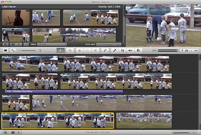
Or itty-bitty ones.
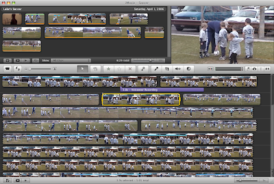
Tiny ones obviously help you see your whole project better. Big ones will help you find the particular point in your footage more easily. The size to which you set your clips will be reflected in the print-out if you decide to print them. ("Print?" Yes, you can print.)
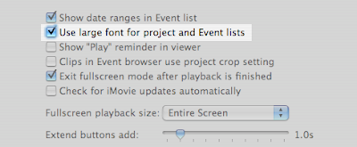
Finally, if the fonts in your project or events lists are too small, you can make them bigger in the iMovie preferences.
(* You earned bonus points if you knew that this section's title comes from a Jamiroquai song.)
Set it, but don't forget it.
You may be a creature of habit, but don't be needlessly stuck in just one way to view your movies. iMovie '08 wants you to shift it, swap it, and twist it around to suit the task at hand. Put this flexibility to good use by being flexible yourself. In then end, it will probably save you time and sore eyes.


1 comment:
Very helpful tips, thank you !
Post a Comment